from: http://www.worldarchitecturenews.com
http://www.designboom.com
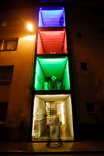
Red Light Districts are commonly littered with many a nook and cranny, dark corners where anything and anybody can lurk, or hide. It would not necessarily be the place to start if you wanted to develop a homestead. But Belgian architects Silvia Mertens and Pieter Peerlings saw an opportunity in Antwerp's former Red Light District, in a space just 2.4m wide, to develop their idea of a home and the headquarters for their business, Sculp(IT).
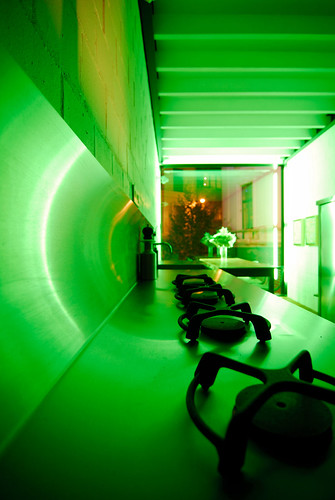
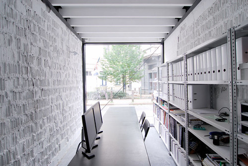
The dimensions offered no choice but to build upwards. Four stories, sandwiched tightly between two buildings, would represent four different living or working spaces. On the ground floor, the office; the second floor, the dining room; the third floor, the living room and the fourth floor, the bedroom.
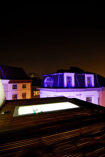
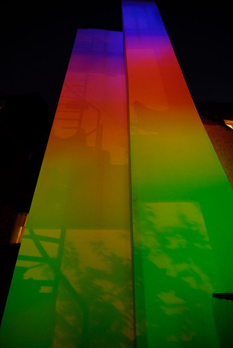
Deciding on the floorplan became a matter of modesty rather than convention as the entire frontage of the building is glazed and open to the outside world. In fact, it stands as a light art installation for passers by and an exercise in exhibitionism which salutes to the less than salubrious past of the area. The bathtub, situated on the rooftop, seals this notion, out of the way of most prying eyes but still deliciously extroverted.
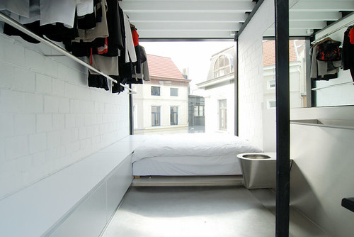
It is clear this is not a place for convention. The bedroom is more jailhouse-chic than anything else with a cold silver floor featuring a splash design and a seat-less toilet taking pride of place beside the bed. The metal spiral staircase, which was inserted in one piece, links every floor for a practical yet equally open effect. There are no doors to prevent the channelling of sound between the floors of the container-esque build.
Lack of space and a need for integration of design require an ultra-minimal way of living for the occupants. Personal effects are left with little space to occupy, a single rail playing host to the pair's clothes. Yet this remains a very personal space, almost exclusive despite it's transparency. In designing a space which is so open, it acts in itself as a public display of affection, a unifying space saying 'us against the world', and as an architects office offers a bold display of their honesty showing their dedication to work and displaying their self-expression in architecture and a sympathy to their surrounds. Not a small achievement for a 2.4m space in the dark alleys of Antwerp's former Red Light District.
Hoover: It is fascinating how some people create space in places where others will not look twice.
http://www.designboom.com

Red Light Districts are commonly littered with many a nook and cranny, dark corners where anything and anybody can lurk, or hide. It would not necessarily be the place to start if you wanted to develop a homestead. But Belgian architects Silvia Mertens and Pieter Peerlings saw an opportunity in Antwerp's former Red Light District, in a space just 2.4m wide, to develop their idea of a home and the headquarters for their business, Sculp(IT).

The dimensions offered no choice but to build upwards. Four stories, sandwiched tightly between two buildings, would represent four different living or working spaces. On the ground floor, the office; the second floor, the dining room; the third floor, the living room and the fourth floor, the bedroom.

Deciding on the floorplan became a matter of modesty rather than convention as the entire frontage of the building is glazed and open to the outside world. In fact, it stands as a light art installation for passers by and an exercise in exhibitionism which salutes to the less than salubrious past of the area. The bathtub, situated on the rooftop, seals this notion, out of the way of most prying eyes but still deliciously extroverted.

It is clear this is not a place for convention. The bedroom is more jailhouse-chic than anything else with a cold silver floor featuring a splash design and a seat-less toilet taking pride of place beside the bed. The metal spiral staircase, which was inserted in one piece, links every floor for a practical yet equally open effect. There are no doors to prevent the channelling of sound between the floors of the container-esque build.

Lack of space and a need for integration of design require an ultra-minimal way of living for the occupants. Personal effects are left with little space to occupy, a single rail playing host to the pair's clothes. Yet this remains a very personal space, almost exclusive despite it's transparency. In designing a space which is so open, it acts in itself as a public display of affection, a unifying space saying 'us against the world', and as an architects office offers a bold display of their honesty showing their dedication to work and displaying their self-expression in architecture and a sympathy to their surrounds. Not a small achievement for a 2.4m space in the dark alleys of Antwerp's former Red Light District.

Hoover: It is fascinating how some people create space in places where others will not look twice.
No comments:
Post a Comment